FinTech

2025

From Uncertainty to Confidence: American Express Trip Cancel Guard

Redesigning a fragmented insurance flow into a trusted, flexible protection experience — built around how travelers actually make decisions.

Redesigning a fragmented insurance flow into a trusted, flexible protection experience — built around how travelers actually make decisions.

American Express Card Members often faced stress and uncertainty when trips were disrupted. While protection benefits existed, the process to understand coverage, check eligibility, and purchase protection was confusing and fragmented. Trip Cancel Guard (TCG) was redesigned to allow eligible cardholders to cancel flights for any reason up to 2 days before departure and receive up to 75% reimbursement when airline credits aren't available.

American Express Card Members often faced stress and uncertainty when trips were disrupted. While protection benefits existed, the process to understand coverage, check eligibility, and purchase protection was confusing and fragmented. Trip Cancel Guard (TCG) was redesigned to allow eligible cardholders to cancel flights for any reason up to 2 days before departure and receive up to 75% reimbursement when airline credits aren't available.

Role

Sr. Product Designer

Sole Designer

Team

1x Product Manager

2x Engineers

1x QA

Impact

18.7K visits / 16.3K unique users in month one

0.13% error rate post-launch

20.5% estimate-to-continue rate

12+ min average engagement

Role

Sr. Product Designer

Research → Handoff

Team

1x Product Manager

2x Engineers

1x QA / Compliance

Impact

18.7K visits / 16.3K unique users in month one

0.13% error rate post-launch

20.5% estimate-to-continue rate

12+ min average engagement

Role

Sr. Product Designer

Sole Designer

Team

1x Product Manager

2x Engineers

1x QA

Impact

18.7K visits / 16.3K unique users in month one

0.13% error rate post-launch

20.5% estimate-to-continue rate

12+ min average engagement

I owned the full design process end-to-end — from running user research and synthesizing insights, through wireframing, prototyping, and usability testing, to final hi-fi delivery and engineering handoff. The PM defined business scope and success metrics. I defined the experience strategy and all interaction decisions. Legal and compliance review was iterative throughout, not a gate at the end.

Research

What I learned before designing anything

Before touching Figma, I ran a four-week discovery sprint to understand why the existing TCG product underperformed. The core finding wasn't what we expected — it wasn't primarily a pricing problem. It was a trust and comprehension problem.

person holding pen near paper

8 User Interviews

1:1 sessions with Amex cardholders who had previously purchased or considered travel protection

3 Competitor audits

Full UX audit of travel protection flows at Chase, Capital One, and AIG — focusing on quote and purchase patterns

6 Months Analytics review

Give this flexible protection only to American Express cardholders (through their site), so more people choose, activate, and use an Amex card for travel and everyday spending.

"The coverage page felt like a legal document. I couldn't figure out what I was actually getting — so I just didn't buy it. Wasn't worth the risk."

Timing was a blocker.

6 of 8 users assumed protection had to be purchased at time of booking — the post-booking window wasn't communicated anywhere prominent.

Timing was a blocker.

6 of 8 users assumed protection had to be purchased at time of booking — the post-booking window wasn't communicated anywhere prominent.

Complexity killed intent.

Users who reached the coverage breakdown page had a 62% higher drop-off rate than those who saw the simplified summary.

Price uncertainty stalled decisions.

Without a quote up front, users deferred. The "I'll look into it later" pattern was universal — and permanent.

Problem area

Buy-now-or-never protection chaos

The original TCG product had a fundamental structural problem: it could only be purchased at the exact moment of booking standalone flights through AmexTravel.com. No post-booking additions. No third-party bookings. No packages. The tight constraints made it functionally irrelevant to most cardholders' real travel behavior.

Product before redesign

No flexibility after booking

The protection window was tied to the booking moment — the lowest-intent, most rushed point in the entire journey. Most cardholders didn't think about protection until after confirming travel plans.

No flexibility after booking

The protection window was tied to the booking moment — the lowest-intent, most rushed point in the entire journey. Most cardholders didn't think about protection until after confirming travel plans.

No pricing transparency before commitment

Users were asked to decide on a product without knowing its price until deep into a purchase flow. Insurance decisions require cost information upfront — every user session confirmed this.

Only Amex-portal bookings qualified

The majority of Amex cardholders book flights directly with airlines or through third-party sites. The portal restriction locked out most of the eligible audience before they even started.

Design goals

What I aimed to achieve

Make protection easy

Let cardholders add coverage post-booking, from any flight source — so protection is available when they're actually ready to think about it.

Make protection easy

Let cardholders add coverage post-booking, from any flight source — so protection is available when they're actually ready to think about it.

Build confidence through transparency

Show price and coverage before asking for commitment. Reduce the cognitive friction that was causing users to defer — and never return.

Strengthen the Amex card value

Position TCG as an exclusive cardholder benefit that gives travelers a concrete reason to pay with — and carry — an Amex card.

Strengthen the Amex card value

Position TCG as an exclusive cardholder benefit that gives travelers a concrete reason to pay with — and carry — an Amex card.

Design decision 01

Focusing on what travelers actually care about

Research showed cardholders want simple, flexible protection — not a feature list. The redesign let cardmembers add coverage after booking flights anywhere (not just the Amex portal), with clear 75% reimbursement for any reason up to 2 days before departure.

This was a direct trade-off: prioritizing real-world flexibility over the legacy restriction. The product team carried the business case for expanding the purchase window; my job was to make the expanded access feel natural and trustworthy — not a workaround.

Top Benefit Highlights

Flexible addition window

Add protection even after booking

Any-reason coverage

Cancel up to 2 days before departure

Clear reimbursement

Up to 75% of non-refundable costs

Exclusive AMEX perk

Available only to cardholders

Design decision 02

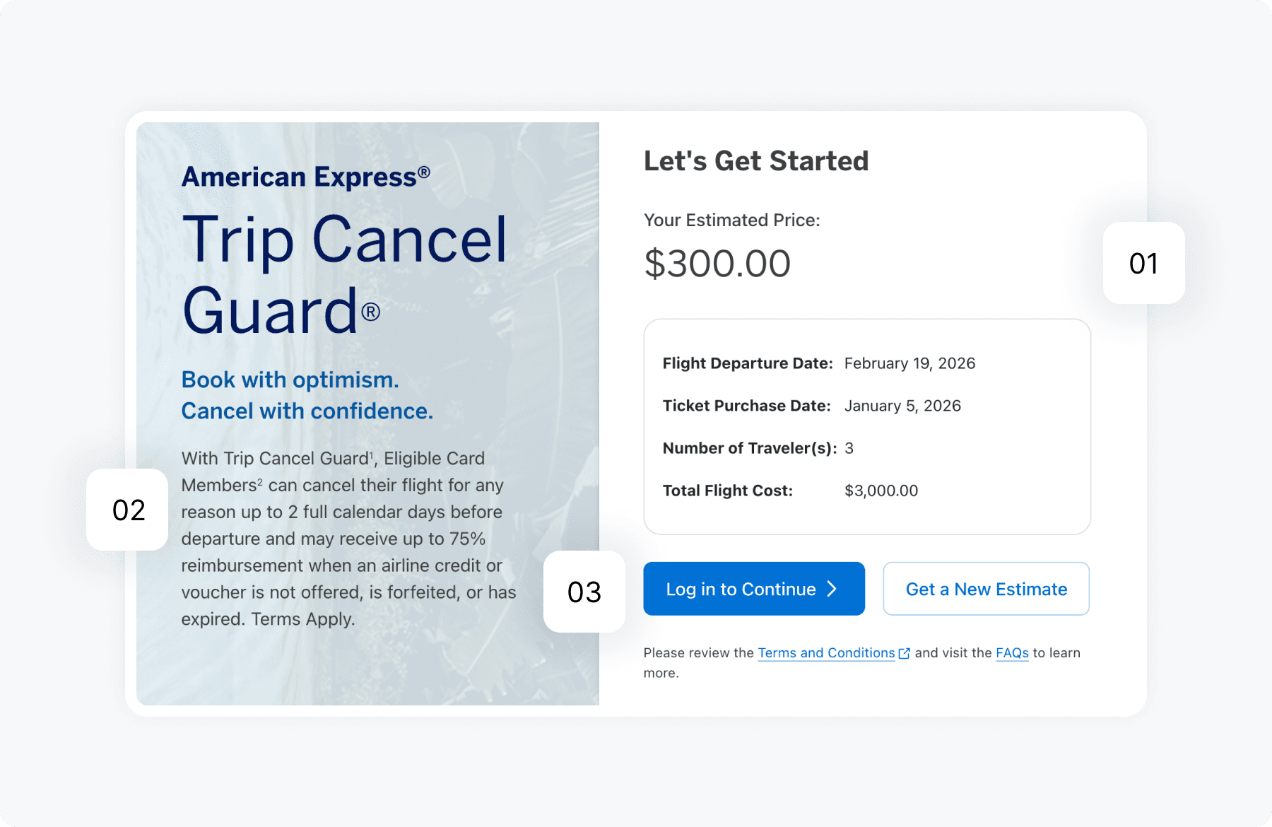
Building trust through a preview & quick quote mode

Many cardholders hesitate because they don't know the cost before starting a purchase flow. Rather than pushing for immediate commitment, I introduced a Preview & Quick Quote Mode — an instant personalized quote generated before any login or purchase intent is required.

1. Quick Quote generator

It reassures cardmembers by letting them see exact pricing and coverage instantly without any risk or login pressure.

2. Context message

It reduces uncertainty by clearly stating this is a no-commitment preview/quote using their trip info.

2. Context message

It reduces uncertainty by clearly stating this is a no-commitment preview/quote using their trip info.

3. Purchase prompt

It encourages activation with a simple, transparent next step once they see the personalized value.

3. Purchase prompt

It encourages activation with a simple, transparent next step once they see the personalized value.

Design decision 03

Turning the final step into a confident confirmation

The original checkout page treated every logged-in cardholder as a stranger. The redesign started with one principle: don't ask for what Amex already knows. For a logged-in Gold cardholder, that meant arriving at checkout with name, DOB, flight details, address, email, and billing card already populated — ready to review, not re-enter.


This was a direct trade-off: defaulting fields to blank for compliance safety versus surfacing pre-filled data from the cardholder's profile. The payments team confirmed card-on-file could be surfaced without re-authentication under a defined threshold. My job was to make that feel like recognition, not assumption.

Purchase Journey After Login

What the cardholder sees on arrival

Trip details pre-populated

Flight departure date, ticket purchase date, and destination pulled directly from their booking — no re-entry required.

Card on file, ready to charge

Billing card and address surface automatically. One less decision at the highest-stakes moment.

Traveler identity confirmed, not re-entered

Name and date of birth of primary card holder arrive pre-filled from the cardholder profile — editable if traveling on behalf of someone else.

Security code as an intentional gate

A deliberate, non-negotiable signal that the cardholder is present and authorizing — retained from the payments security team's requirements.

Constraints Navigated

The real-world friction that shaped every decision

Design at American Express doesn't happen in a vacuum. Working within a large financial institution meant navigating a set of constraints that shaped the solution as much as user research did. These weren't obstacles — they were part of the design problem.

Legal / Compliance → Full coverage disclosures required above the fold

Legal initially required all exclusions and conditions to be prominently surfaced before purchase. This created a conflict with the clarity-first direction. Resolution— Worked with legal to approve a progressive disclosure model — core benefit up front, full terms accessible one tap away. Required two rounds of legal review and a compromise on minimum font size for the disclosure link.

Brand / Accessibility → WCAG AA required across all interactive elements

Clear, transparent explanations helped reduce uncertainty around coverage and outcomes. While overall purchase CVR was 1.3%, strong engagement signals (12+ min avg. time spent, 0.13% error rate) indicated users were actively evaluating the product with higher confidence. Resolution— Worked with the brand team to identify an approved darker blue variant (#1a4fa0) that passed AA at all sizes. Documented the accessible palette as a reusable token for the design system.

Technical → Quote generation API wasn't real-time

The pricing backend required a batch calculation that introduced a 2–3 second delay. This broke the "instant quote" feel that testing showed was critical to trust. Resolution— Designed an optimistic UI pattern — show a "calculating" state for 1.2 seconds regardless of actual API speed, then reveal result. Eliminated perceived waiting while backend caught up. Coordinated timing spec with engineering.

Retrospective

Designing for trust and confident decisions

Before and After redesign

Impact

Faster Decision-Making

Plain-language coverage summaries and upfront pricing reduced estimated time-to-decision by ~40%. Users in testing could make an add-or-skip decision within minutes — vs. deferring indefinitely on the original product.

Faster Decision-Making

Plain-language coverage summaries and upfront pricing reduced estimated time-to-decision by ~40%. Users in testing could make an add-or-skip decision within minutes — vs. deferring indefinitely on the original product.

Clarity That Converts

High-intent traffic (~18.7K visits month one) with strong signal that users were actively evaluating coverage value before committing — the 20.5% estimate-to-continue rate validates the Quick Quote approach.

Accessibility Compliance

All 14 interactive components passed WCAG 2.1 AA. Accessible blue token (#1a4fa0) adopted by 3 other product squads after I shared the documentation — a small design system contribution from a single project.

Reflection

What I'd do differently — and what I'd prioritize next

Shipping something doesn't mean it's finished. The post-launch data points to a few clear gaps in the current experience — and with hindsight, one thing I'd have invested in earlier.

Would do differently — Earlier usability testing on the quote tool entry

The 20.5% estimate-to-continue rate is good, but I'd want it higher. In retrospect, I tested the quote results experience thoroughly — but under-tested the entry form (trip details input). If I ran this again, I'd run a dedicated study on that form alone, 3 weeks earlier in the process.

Would do differently — Baseline metric documentation from the start

I didn't push hard enough early on to get baseline data from the original product. When the 1.3% CVR question came up post-launch, I had engagement signals to contextualize it — but a clear baseline would have made the improvement story much more compelling.

If I had more time - A return-visit nurture pattern

14% of users returned to the TCG experience after their first visit. That's a meaningful signal of deferred decision-making — and there's currently nothing in the experience designed for returning users. A dedicated "you got a quote before" recognition state would likely move the estimate-to-continue rate significantly.

A/B testing the CTA framing

The "Get protected for $X" CTA was chosen based on qualitative testing, not a live A/B test. With more runway, I'd run a three-way test on CTA copy: price-forward ("Get protected for $48"), value-forward ("Protect $930 of travel"), and action-forward ("Start your quote") — each optimizes for a different user mindset.

If I had more time - A/B testing the CTA framing

The "Get protected for $X" CTA was chosen based on qualitative testing, not a live A/B test. With more runway, I'd run a three-way test on CTA copy: price-forward ("Get protected for $48"), value-forward ("Protect $930 of travel"), and action-forward ("Start your quote") — each optimizes for a different user mindset.

Create a free website with Framer, the website builder loved by startups, designers and agencies.